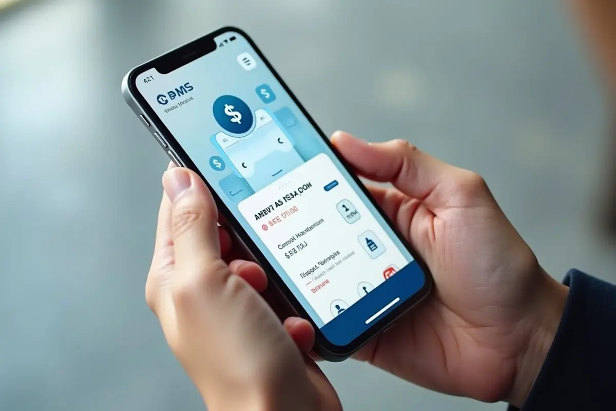
In today’s fast-paced digital world, mobile app notifications have become invaluable touchpoints that shape how users interact with applications. A well-crafted notification can drive engagement and improve satisfaction, while poorly executed alerts may frustrate users or prompt them to opt out of future messages.
Creating effective notification screens is essential for any app aiming to enhance usability and strengthen its connection with its users. To explore successful approaches and visual inspiration, consider browsing leading examples of mobile app notification UI design.
Getting notification design right means understanding not just what users want but also what they will tolerate. A user-friendly notification experience keeps information relevant, clear, and actionable. When done well, it keeps users engaged without feeling interrupted or overwhelmed.
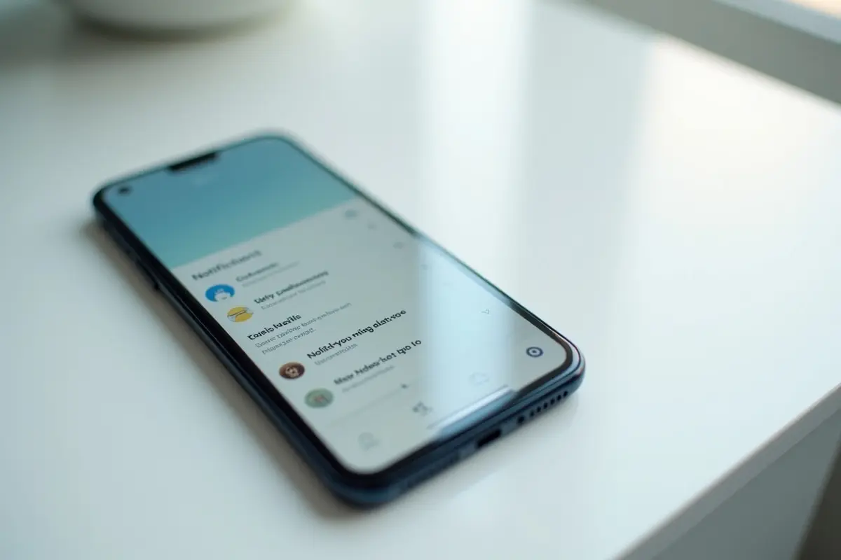
Understanding the Anatomy of a Notification
A notification is more than just a pop-up alert. Its main components guide users in understanding, prioritizing, and responding to messages quickly. Most notifications include an app icon for instant recognition, a brief headline or header text, supporting content for details, a timestamp for context, and interactive actions for direct engagement. Grasping these elements is the foundation for designing notifications that feel intuitive and foster positive interactions.
Implementing Notification Channels
Notification channels give users meaningful ways to adjust which alerts they wish to see and how they are surfaced on their device. For instance, a messaging app can offer different channels for direct messages, group updates, and marketing announcements. This granular control lets users tailor their experience, eliminating unwanted alerts while maintaining the updates they actually care about. Empowering users to manage their preferences independently can dramatically boost long-term satisfaction and reduce opt-out rates.
Utilizing Notification History
Users sometimes accidentally swipe away or dismiss important notifications. By integrating a notification history feature, your app enables users to revisit previous messages and never miss critical information. This safety net not only improves user confidence but also reduces frustration when navigating crowded notification trays. It is a simple yet powerful step toward a more reliable and user-centric design.
Incorporating Swipe Gestures
Efficient notification management relies heavily on smooth tactile interactions. Swipe gestures are now an industry standard for dismissing, archiving, or revealing more options within notifications. Whether it is swiping left to remove an alert or right to access secondary actions like snooze or reply, these gestures make ongoing notification management faster and more comfortable. They ensure that important notifications are easy to filter and less relevant alerts are cleared with minimal friction.
Designing for Levels of Severity
Not every notification justifies an equal claim on a user’s attention. Classifying alerts by severity helps users identify the most urgent messages. For example, security warnings or payment failures need high-visibility treatments, while reminders and news updates can be more subdued.
By visually and functionally distinguishing high, medium, and low-severity notifications, you allow users to triage incoming messages and address objectives in order of importance. According to the Android Developers Guide, choosing the appropriate notification type for the use case enhances the user experience.
Balancing Frequency and Relevance
Excessive notifications can quickly wear down user patience, leading to notification fatigue. It is vital to design alert frequency so that each notification delivers timely and relevant information. Junk or repetitive messages diminish user trust and engagement, whereas valuable, well-timed notifications (such as app feature updates or reminders about expiring offers) reinforce positive usage.
Apps that successfully balance alert frequency with relevance consistently report higher retention rates, as showcased by MobileAppDaily in their UX research.
Ensuring Accessibility
Making notifications accessible benefits every user, especially those with disabilities. This includes providing alternative text for visuals, using simple and direct language, and ensuring compatibility with mobile screen readers.
Additionally, color contrast and text size should be considered so that all users, regardless of visual ability, can interact with notifications seamlessly. These accessibility best practices align your app with modern usability standards and expand your audience reach.
Testing and Iteration
The difference between a tolerable and a compelling notification design often comes down to thorough testing and rapid iteration. Leverage A/B testing, analyze engagement metrics, and solicit real user feedback to measure effectiveness.
By staying open to changes and learning from user data, you can refine notification strategies that increase engagement and promote continual improvement. This iterative design process ensures that your app’s notifications not only attract attention but also nurture long-term user loyalty.
Mastering the design of mobile notification screens is a proven way to drive higher engagement, minimize frustration, and create a more enjoyable user experience. By focusing on clarity, personalization, relevance, and accessibility, you give your app the best chance to make a positive, lasting impact.