In the highly competitive landscape of mobile applications, making a strong first impression is essential for user retention. The welcome screen, also known as a splash or get-started screen, is the user’s very first encounter with your app, and its design plays a pivotal role in shaping the overall user experience.
Understanding how to build an effective, visually appealing welcome experience can increase engagement and improve user satisfaction. For those seeking real-world inspiration, you can explore numerous app welcome screen examples from widely recognized mobile products.
When designing a welcome screen, it is important to strike a balance between speed, brand loyalty, and value proposition. A well-crafted welcome screen should quickly communicate your app’s identity and set expectations for what follows. These early micro-interactions influence how users perceive your app’s professionalism and usability.
Understanding the Role of Welcome Screens
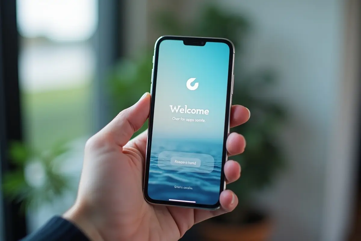
The welcome screen is not just a placeholder while your app loads. Instead, it is a branding opportunity and a first impression that can instantly engage new users. Well-executed splash screens often highlight a brand’s logo, an engaging graphic, or a succinct message that introduces the app’s core function.
In many cases, this is the window in which users decide whether to continue exploring your app or lose interest, which is why attention to every element is necessary. A welcome screen also bridges the gap between launching the app and loading content, subtly guiding the user through the brief wait time.
These screens may feature static visuals, animations, or progress indicators to visually communicate that the app is initializing. Some platforms, such as Android and iOS, have specific guidelines for splash screen dimensions and behavior that developers should consider to ensure a seamless user experience.
For further foundational principles, exploring mobile UX research by Nielsen Norman Group can help reinforce the significance of welcome screens within the broader mobile user experience.
Best Practices for Designing Welcome Screens
1. Keep It Simple and Memorable
Simplicity is at the heart of effective welcome screens. Avoid overloading users with too much information or too many visuals; instead, aim for a clean design that showcases your brand elements. This approach helps ensure that loading times are minimized and that branding remains memorable. Minimalist screens with bold logos or taglines are more likely to create a lasting impression without becoming a barrier to app usage.
2. Ensure Brand Consistency
Your welcome screen should seamlessly align with the app’s look and feel. Consistency in color schemes, typography, and iconography reinforces brand recognition and helps users transition smoothly into the app environment. This attention to branding details fosters trust with new users and makes the app feel polished and professional.
3. Optimize Load Time
The best welcome screens are quick, typically following the “3-second rule”. If the loading screen lingers for more than three seconds, users may become impatient and abandon the app. For apps that are opened frequently (such as social or messaging tools), consider using even shorter durations or experimenting with loading indicators and progress animations to maintain perceived speed and minimize friction.
Developers should also optimize images and animations to ensure that welcome screens do not negatively affect overall app performance or data costs. For more on performance best practices, Google’s developer guide on performance is a valuable resource.
4. Provide Value Immediately
Use your welcome screen to reinforce your app’s mission and immediately present value to the user. A concise statement or headline, coupled with attractive visuals, can reassure users that they are in the right place and encourage continued engagement. This initial value proposition can make the difference between a fleeting visit and a new loyal user.
Real-World Examples of Effective Welcome Screens
1. Kindle App
The Kindle app is celebrated for its inviting splash screen, which combines bold colors with a clean visual featuring its instantly recognizable logo. This approach not only captures attention but also subtly cues users about the app’s core purpose of reading and relaxation, without overwhelming them with unnecessary graphics or information.
2. Slack
Slack uses skeleton screens to reduce user wait time and show the application’s basic structure as it loads. This method reduces user anxiety, communicates that progress is being made, and sets user expectations about where and how they will begin interacting once the app is fully loaded.
These real-world approaches exemplify how effective welcome screens rely on minimalism, informative content, and consistency to create a positive user impression from the outset.
Conclusion
The design and execution of a welcome screen should never be an afterthought in mobile app development. By focusing on simplicity, branding, load optimization, and an immediate value proposition, you build trust with your users from the start. Drawing inspiration from successful apps and adhering to best practices ensures that your welcome screen supports not only engagement but also long-term retention, which drives app success.